PORTFOLIO
︎ Branding
HighLow™ Apparel
The Grid
Sunwhip
Cantina
Got Chew
Mingle Cocktail Bar
Nest Keepers
MERC Rebrand
the Good Treat
Mycelium Logo
MERC Summit 2023
︎ Posters
Alexis Mark Studio
Eagles Super Bowl LIX
Kendrick Lamar Performance
Pecha Kucha
HighLow™ Promo
Francisco Echo Eraso
Queer Ecology
Other Means
︎ Publications
[homebody]
Routine
MERC Summit 2023
︎ Mixed Media
Be a Man
Carbon Footprint
Etch A Sketch
Vampire Hysteria
Ocean Currents
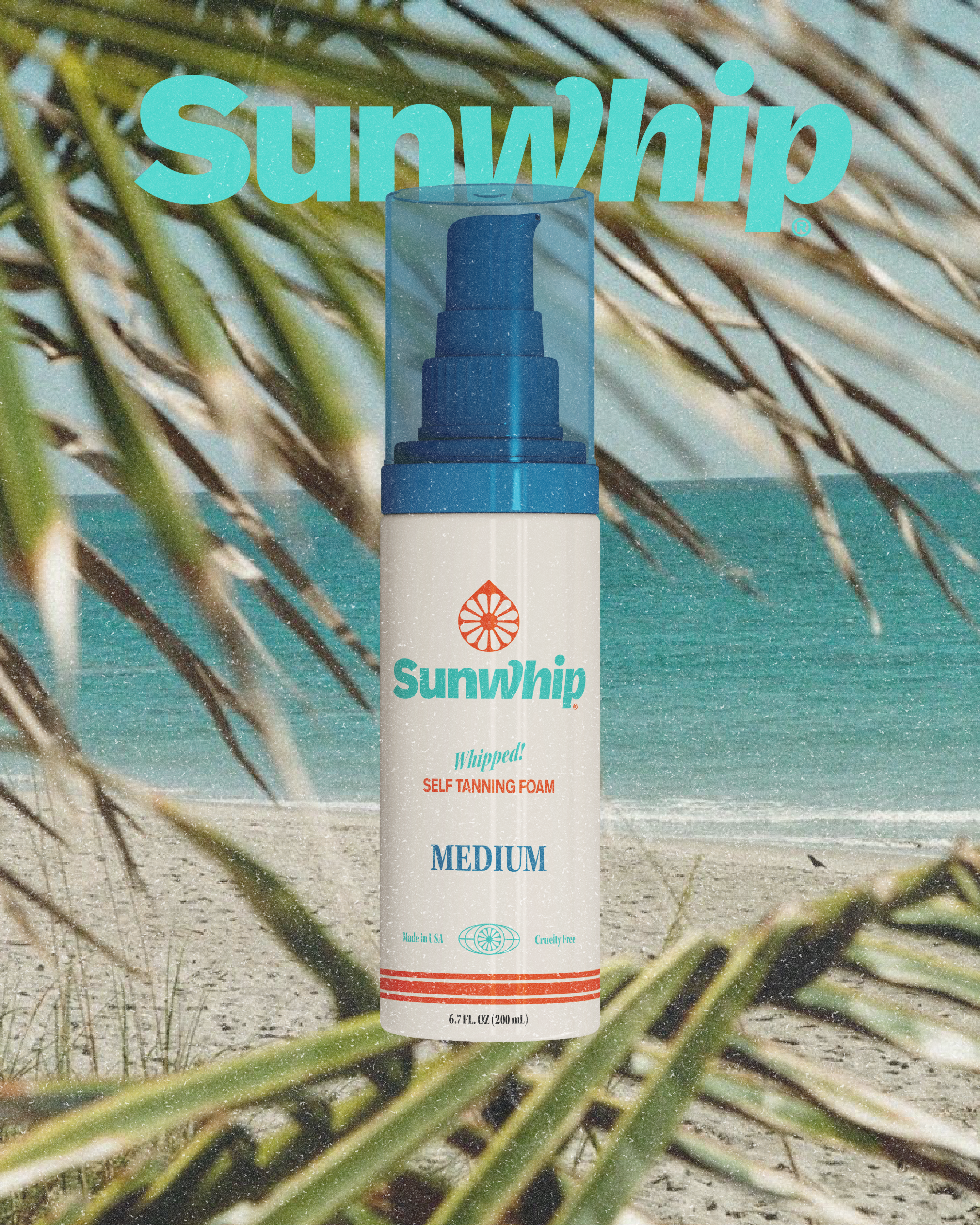
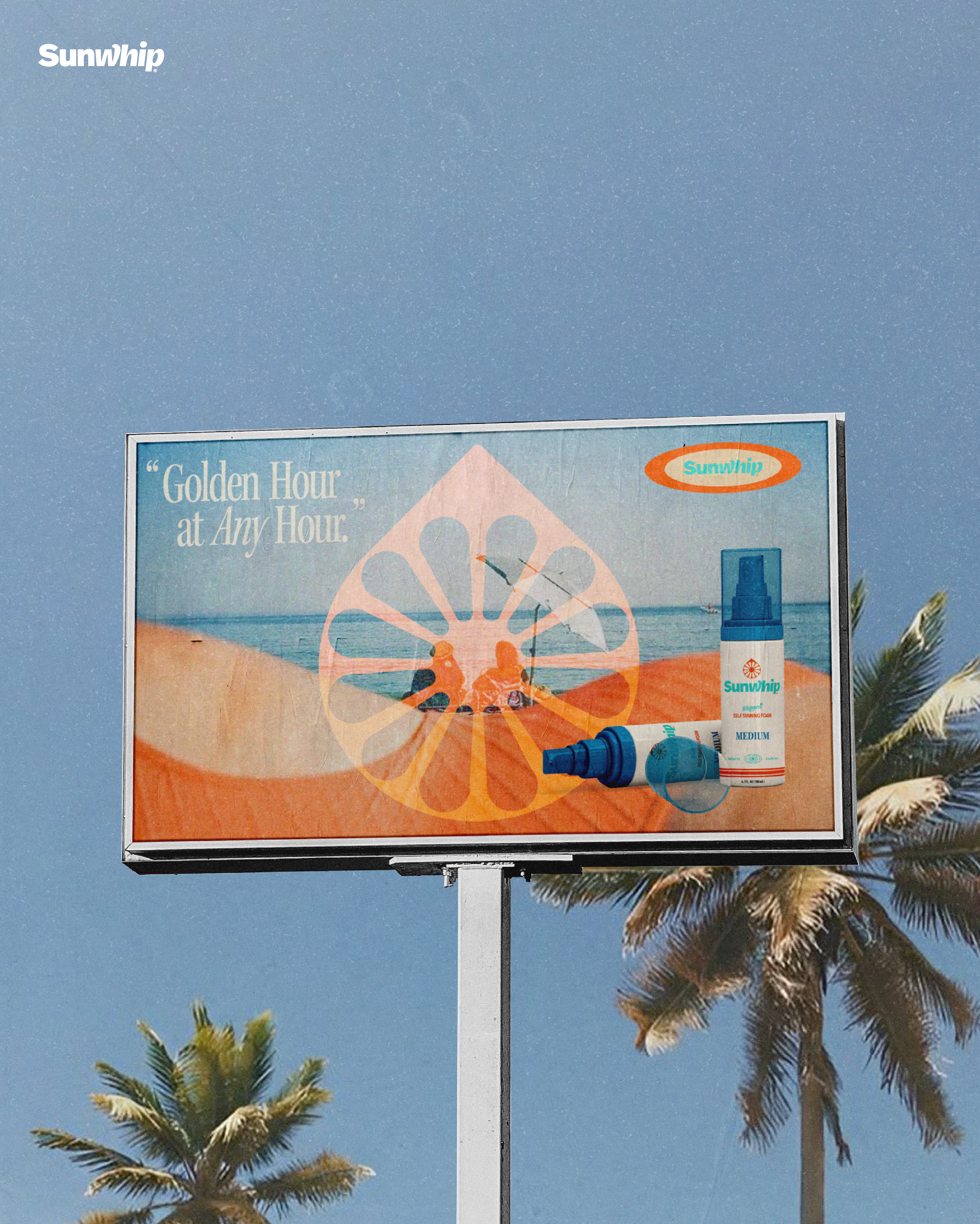
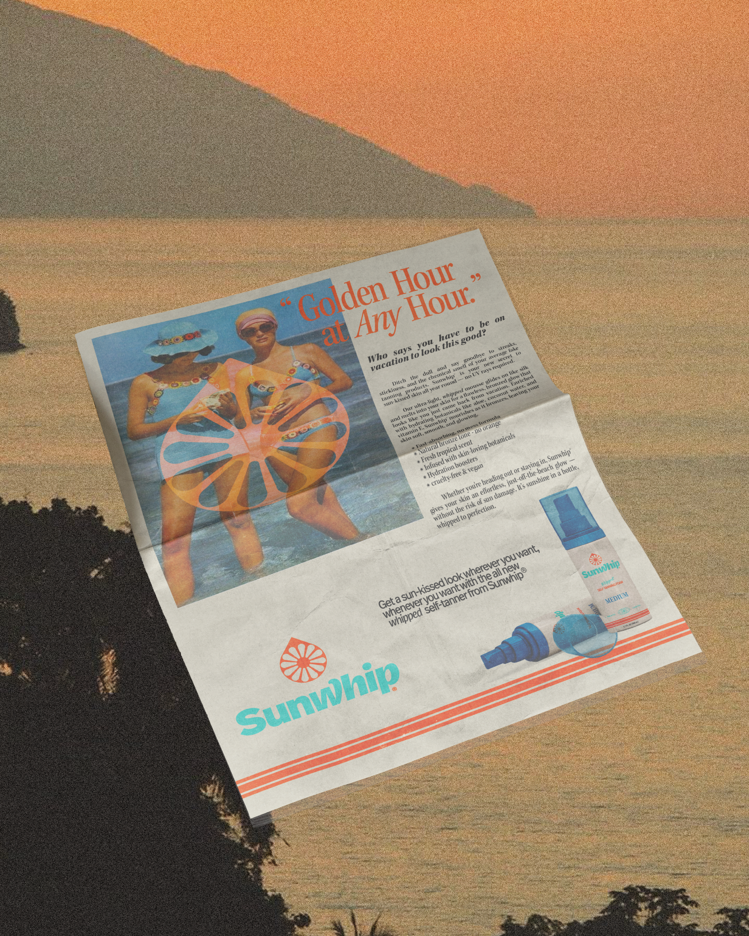
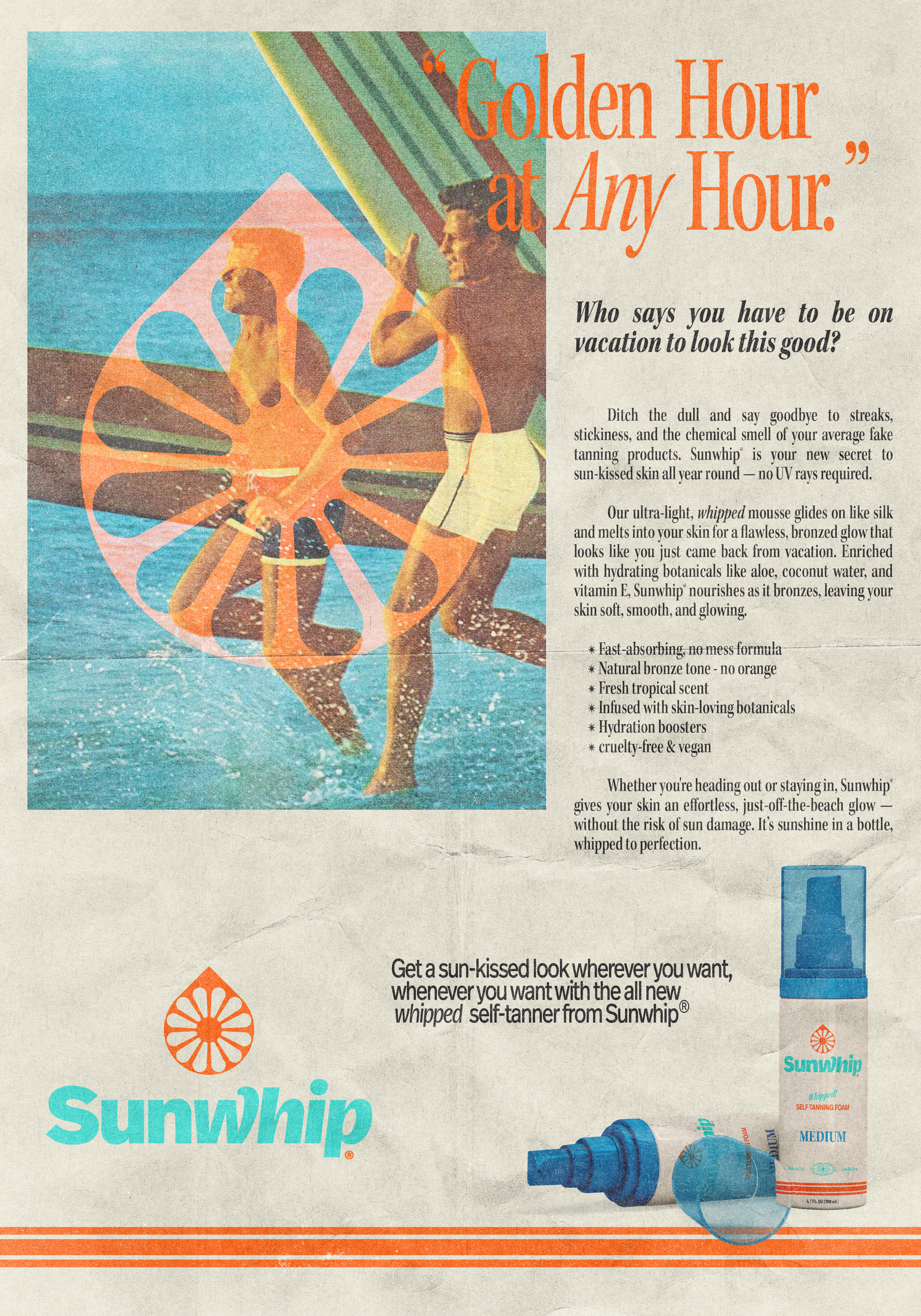
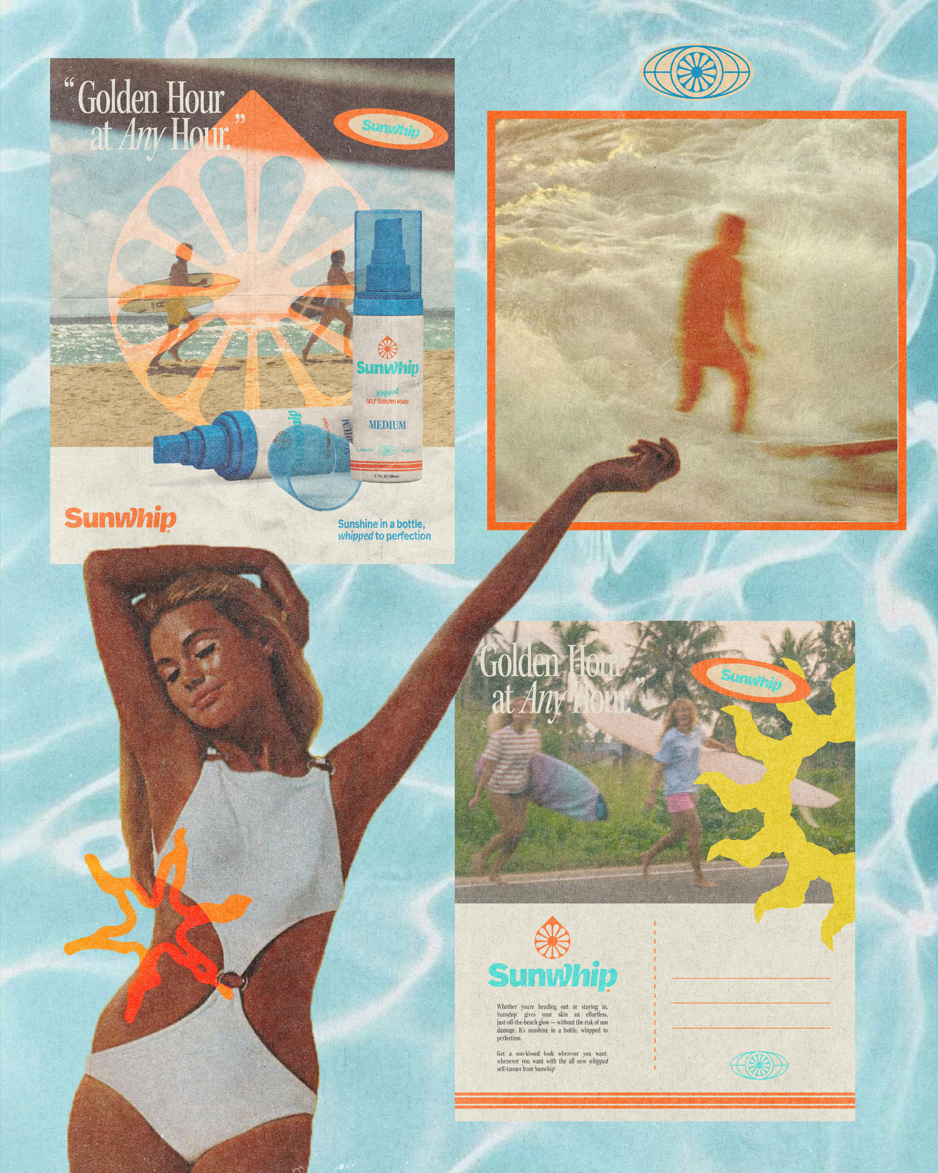
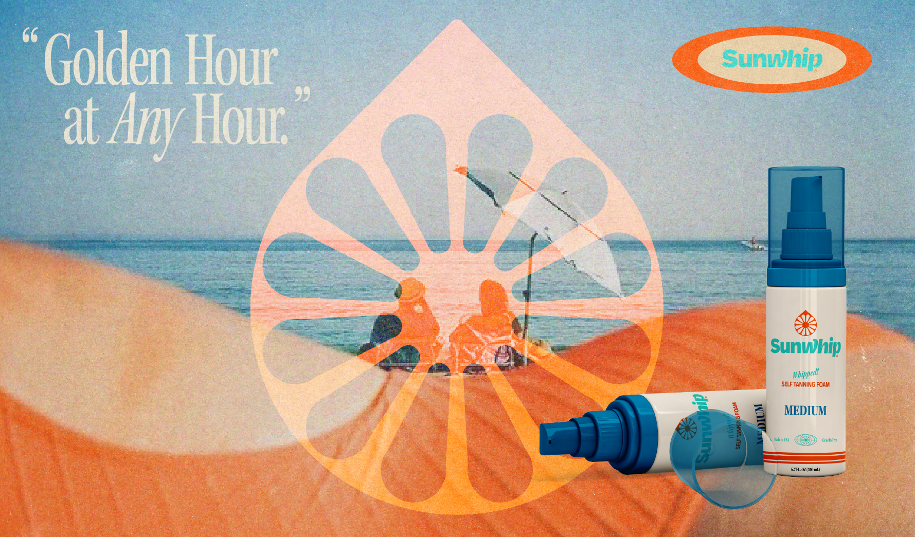
Sunwhip Self-Tanner
APRIL / 2025
Project Type: Logo, Visual Identity, Branding, Apparel, Marketing, Package Design
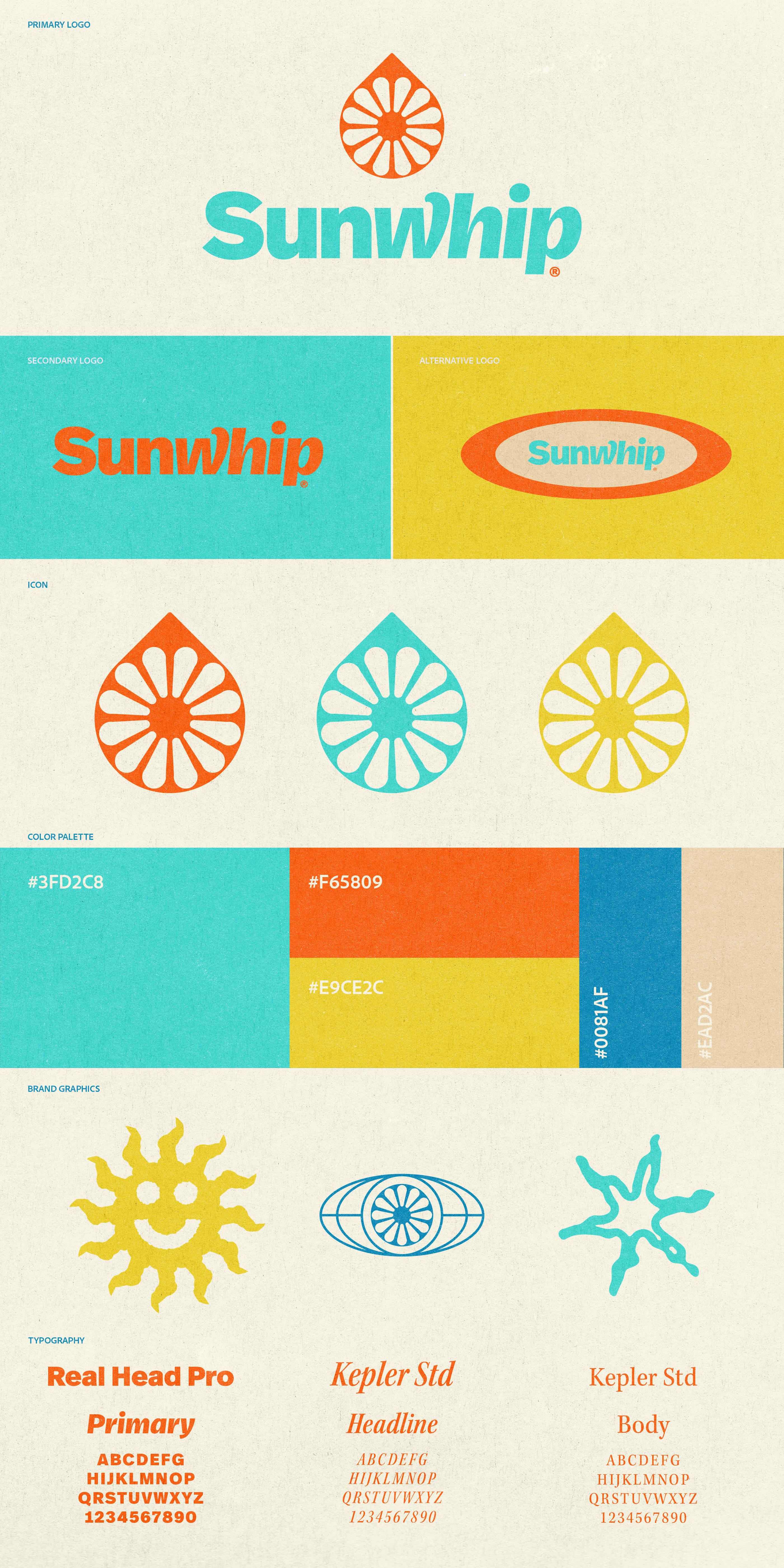
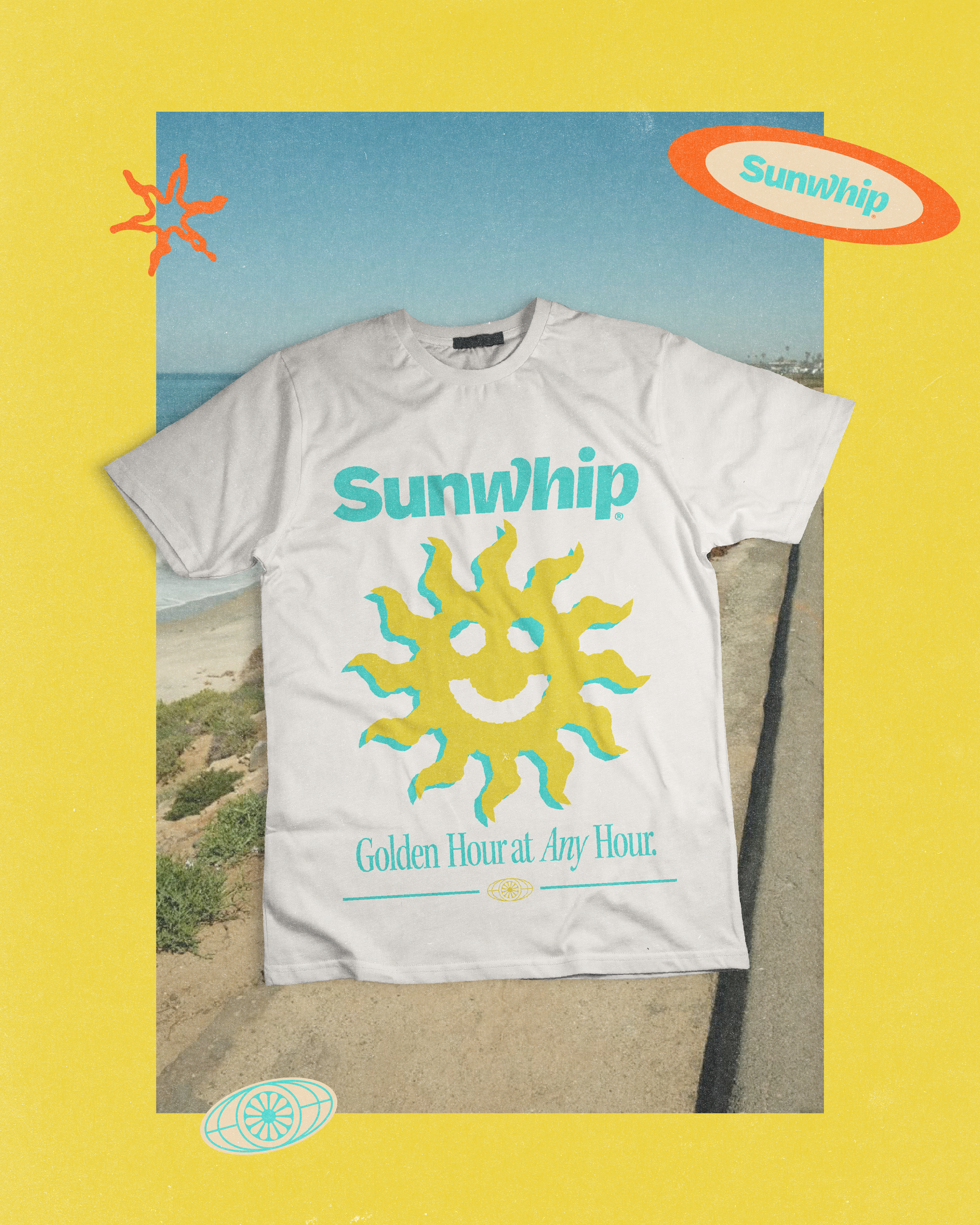
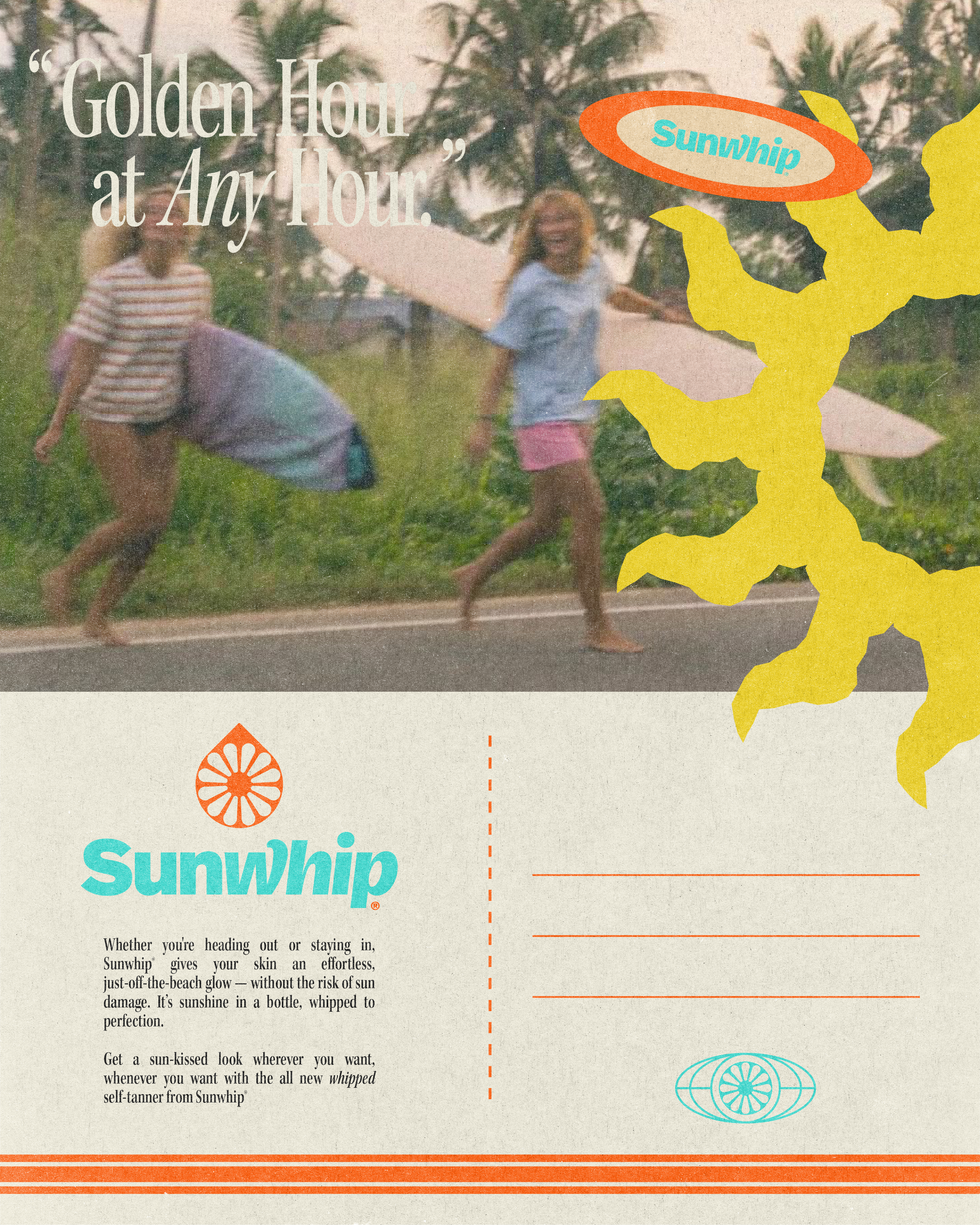
Sunwhip is your new secret to sun-kissed skin whenever you want, wherever you want with no UV rays required. Whether you’re heading out or staying in, Sunwhip gives your skin an effortless, just-off-the-beach glow in minutes with zero risk of sun damage. A product as bright and refreshing as Sunwhip deserves an equally bold and sun-inspired visual identity, that’s why this branding exudes a playful yet refined aesthetic, grounded in vibrant color, dynamic typography, and retro-inspired design elements that evoke warmth, energy, and optimism.
The primary logo features an icon of a stylized sunburst inspired by the look of a citrus slice and sun rays that’s resting within a single droplet shape to symbolize that Sunwhip truly is “sunshine in a bottle, whipped to perfection”. The color palette is bright and energetic to further reinforce the sunny and refreshing brand personality while the additional logo variants provide flexibility across different brand touch points. The secondary logo focuses solely on the bold, customized logotype, while the alternative logo adopts a retro badge style, ideal for packaging or social media.
Pairing a retro-inspired sans-serif font with a classic, editorial serif typeface captures the feel of vintage surfer magazines and sunscreen ads, evoking the nostalgic and joyful brand essence. The custom illsutrations expand the visual identity’s imaginative personality and can be used throughout different brand collateral for a cohesive look. Overall, this branding is fresh, flexibile, and immediately recognizable, which perfectly aligns with the Sunwhip name and values.